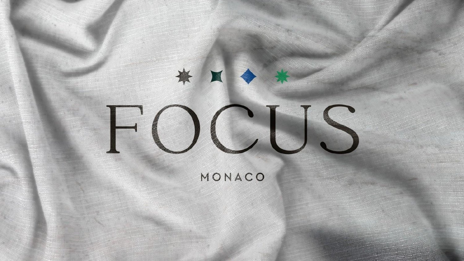
Born from light.
Built with clarity.
My work is grounded in a simple belief:
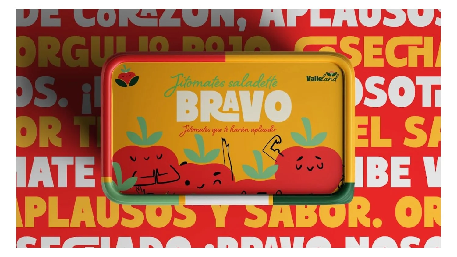
A brand is not just what it looks like. It’s the idea that holds everything together. That’s why every project begins the same way, by understanding what the brand truly is, what it needs to communicate, and how it should move forward.

From there, strategy becomes direction. Direction becomes system. And system becomes presence. Great brands are not accidents. They begin with clarity.


I’m Alejandro Lomelin, founder of Lomelin Studio.
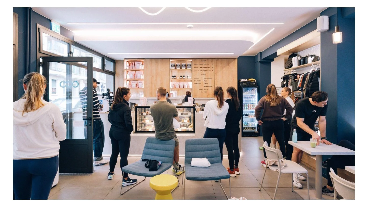
For more than a decade I’ve worked at the intersection of brand strategy, creative direction and identity development, helping companies build brands with more clarity, stronger standards and a more intentional presence.
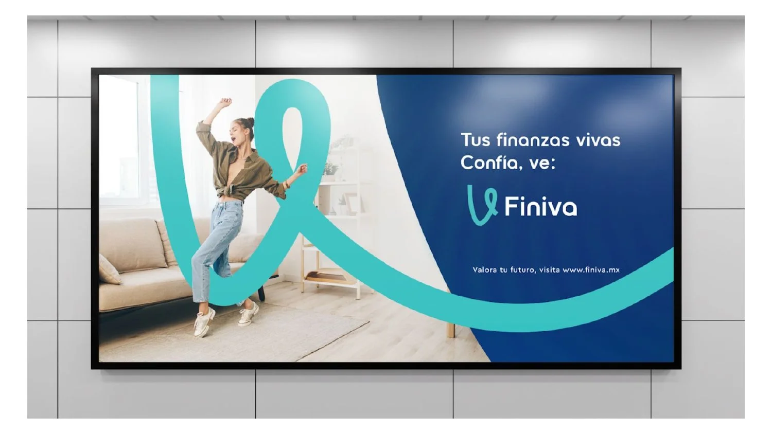
Because a brand is not just how it looks, it’s how it positions itself in the world.


Trusted by:
A limited number of projects are taken on each quarter.
If you’re building something meaningful and want your brand to match its ambition.